What Information Has to Stay Visible in a Casino Game Interface?
A casino game interface has a harder job than simply looking exciting. It must show the game, explain what the player can do, and make real-money decisions understandable—all on a screen that may be only a few inches wide. When important details disappear behind decorative effects, tiny labels, or unclear icons, the interface stops being merely inconvenient. Players can lose track of their stake, misunderstand a rule, or mistake a balance for a win amount.
The practical test is simple: at a glance, can someone tell what game they are playing, what they have wagered, what they could win, and what action comes next? Good game info layout keeps those answers close to the action without letting controls and text compete with the game itself. This guide covers the information that should stay visible, how to prioritize it, and how to check it on a phone or mobile browser.
Start With the Decisions Players Need to Make
Designing a casino interface is not just an exercise in arranging attractive panels. The layout supports decisions involving money. Players need clear, timely information before they place a wager, while a round is underway, and when it ends. The interface should not rely on a player remembering a detail they saw several screens ago or guessing what an icon means.
Before drawing a screen, list the questions a player may ask at each stage:
- Before a round: What is my current balance? What is the stake? How do I change it? What is the minimum or maximum?
- During a round: Is the game still active? What choices are available? Can I pause, cancel, or change anything?
- After a round: What was the result? Was a payout awarded? What is my updated balance?
- At any time: Where can I find the rules, paytable, help, and relevant game or account information?
These questions make a useful design checklist. If answering one requires a hunt through menus, a player may miss information at exactly the moment it matters.
Build a Clear Visual Hierarchy
Visual hierarchy tells players where to look first, second, and third. This reminds me of something that happened was shocked by the final bill.. In a casino game, the game action is often the focal point, but it should not be the only focal point. Stakes and balances, result messages, and the primary controls also need enough visual weight to be found quickly.
A practical hierarchy usually has three levels:
- Primary: The active game area and the main action, such as Spin, Deal, or Draw.
- Secondary: Stake, balance, potential payout information, and round status.
- Supporting: Rules, settings, sound controls, history, and help.
This does not mean supporting information should be hidden or made illegible. It means that it can sit behind a clearly labeled, consistently placed control when it is not needed continuously. A player should be able to reach the rules quickly, while the main game screen remains focused.
Use contrast, spacing, size, and position to distinguish these levels. Avoid making every button glow, pulse, or use the brightest color in the palette. When everything calls for attention, nothing does. Motion should communicate a meaningful state change—for example, that a round has resolved—not add constant visual noise.
Keep the Focal Point Stable
Players benefit when the game action stays in a predictable area and key information does not jump around between screens. A balance that moves from the top of the screen to a pop-up after each round is harder to track. So is a primary button that shifts position when an animation or result banner appears.
Reserve stable regions for the game, the main action, and the money information. Result messages can appear near the relevant action, but they should not cover the stake or hide the next-step control. On a small display, a compact, consistent layout is often more useful than a theatrical one.
Make Stakes and Balances Unmistakable
Money-related information deserves especially careful treatment. The current balance, selected stake, and any displayed win or payout should be visually distinct from one another. Similar-looking numbers placed together can invite mistakes, particularly when the game uses animation or a fast round sequence.
Use explicit labels such as Balance, Bet, and Win rather than relying on position, color, or an unexplained symbol. Keep currency units visible wherever a number could otherwise be ambiguous. If a value updates, show the change clearly and avoid animating it so quickly that the player cannot read mangaowl it.
Information What should be clear Common layout risk Balance The available account amount and its currency It resembles the win amount or disappears during a round Stake The amount committed for the current play It is shown only inside a collapsed settings panel Win or payout The result amount and what it refers to It is communicated only with celebratory animation Game controls Which action is available and when it can be used Disabled and active states look nearly identical Rules and paytable How to open the information and what it covers A generic icon has no text label or discoverable meaningDo not use color alone to distinguish a stake from a win or a positive result from a negative one. Color vision, screen brightness, and ambient light all vary. Pair color with a text label, shape, or other clear cue.
Keep Rules Visibility Within Reach
Rules visibility is part of the game experience, not a legal-looking afterthought. Players should be able to find the basic rules and relevant paytable without leaving the game or losing their place. Depending on the game, useful information may include how a round works, how outcomes are determined, what special symbols or features do, and how payouts are calculated.
On a phone, a full rules document may not belong permanently on the main screen. But the route to it should be obvious. Use a recognizable text label such as Rules or How to Play, especially if the interface also includes less familiar settings icons. A labeled control reduces guesswork and is easier to understand than an isolated question mark or decorative badge.
Present rules in short sections with clear headings. Avoid dense paragraphs set in small type over a patterned background. If details require scrolling, maintain a clear close or return control, and make sure closing the rules returns players to the same game state. The interface should not make someone restart a round simply because they checked how a feature works.
Separate Essential Information From Promotional Content
Bonuses, offers, and event announcements may be part of a product, but they should not crowd out rules, stake controls, or balance information. The order of emphasis matters. If a promotional banner is larger and more vivid than the current stake, the interface is communicating the wrong priority—especially where a real-money choice is involved.
Design for Small-Screen Readability
A desktop layout shrunk to phone size is not a mobile layout. On a phone or mobile browser, labels can become cramped, touch targets can be difficult to hit, and the browser’s own interface may reduce the available viewport. Players may also use their phone outdoors, at low brightness, or with text scaling enabled. A design that looks clear in a large mockup can fail under those conditions.. (my cat just knocked over my water)
Check actual screens at multiple sizes and zoom levels. I like to inspect a design at 25%, 50%, and 100% zoom: the smaller views reveal hierarchy and clutter, while the full-size view exposes label and control details. Also test the live experience in a phone or mobile browser, where scrolling, browser chrome, and touch behavior affect what is visible.
- Use readable text sizes and strong contrast against the background.
- Keep money values and their labels together so their meaning is not lost.
- Allow enough spacing around controls to reduce accidental taps.
- Make active, inactive, selected, and disabled states visibly different.
- Check that landscape and portrait orientations do not hide essential information.
- Test text enlargement and narrow screen widths instead of assuming one device size.
A quick thumb-reach check is useful, too. Note how many taps it takes to reach a frequently used control and whether the main action sits in a comfortable area for one-handed use. A critical action should not be placed so close to another control that an ordinary thumb tap can trigger the wrong one. At the same time, do not enlarge a real-money action so aggressively that it dominates the screen or encourages a rushed decision.
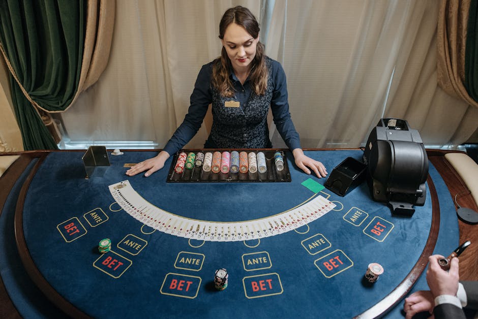
Give Controls Enough Space
Game controls, money information, and game art all compete for limited space. The solution is not to shrink everything until it fits. Group related controls, make their purpose clear, and decide which items need to remain visible throughout a round.
For example, a stake adjustment can sit beside the current stake, while less frequently used settings live in a clearly labeled menu. Avoid hiding core information behind controls that change state without explanation. If a button is disabled, show why where practical, or provide a concise explanation when the player selects it.
Plan for interruption states as well as the normal screen. A connection message, round result, or confirmation dialog should not obscure the balance or make the primary action appear available when it is not. Pop-ups should be easy to read, have a clear way to dismiss them, and avoid placing a close control directly beside an action with a financial consequence.
Use Recognizable Silhouettes and Shapes
Shape and silhouette help players recognize an object or control before they read its label. Card outlines, dice forms, reels, chips, and familiar button shapes can make a game easier to scan. Pretty simple.. Consistent silhouettes also help the interface remain understandable when color is unavailable, reduced, or difficult to distinguish.
However, recognizable shapes should support meaning rather than replace it. A chip-like circle may suggest a bet, but the amount and currency still need a text label. A gear may suggest settings to some players, but it should not be the only path to rules or help. Use familiar visual conventions, pair icons with labels where clarity matters, and keep the same shape-to-function relationship throughout the game.
Choose Backgrounds That Protect Legibility
Atmospheric imagery can strengthen a game’s visual identity, but text should never have to compete with a busy background. If you use photography from a resource such as Unsplash during prototyping, treat it as visual material to evaluate—not as a reason to place small labels directly over detailed imagery. Crop, darken, blur, or simplify the image behind information, and use a solid or translucent panel when needed.

Check contrast in the actual interface, not only in a clean design file. A label may be readable over one part of a photograph and disappear over another. Keep key figures on a consistent surface so players do not have to search for them as the background changes. Decorative textures, animated light, and confetti should never obscure a stake, balance, result, or control label.
A Practical Review Before Release
Use a short review process to catch problems before they reach players. This is more reliable than judging a screen only by whether it feels polished.
- Identify the decision points. List what players need to know before, during, and after a round.
- Check the hierarchy. Confirm that game action, stakes and balances, and the next available action are easy to find.
- Read labels at phone size. Test on a real device or mobile browser, including narrow screens and enlarged text.
- Count taps. Check how many taps it takes to reach rules, adjust the stake, and find help. Consider thumb reach and accidental-tap risk.
- Test states, not just screens. Review active play, disabled controls, results, errors, and interruptions.
- Check the background. Confirm that contrast and text legibility hold across every crop and animation state.
Ask testers to explain what the displayed balance, stake, and result mean in their own words. If they confuse those values, the problem is probably the game info layout—not the player. Likewise, if they cannot locate the rules without a hint, improve the label or placement rather than assuming they will learn the icon.
Conclusion: Keep the Important Information in Sight
Want to know something interesting? a strong casino game interface makes the game engaging without making its mechanics or money information difficult to understand. Keep the focal point stable, make stakes and balances unmistakable, put rules visibility within easy reach, and give controls enough space for accurate use. On small screens, test real text sizes, thumb reach, contrast, and touch behavior instead of trusting a scaled desktop mockup.
The best measure of the layout is not how much fits on screen. It is whether players can quickly understand what they are seeing, what action they are taking, and what that action means—without the interface hiding the details behind visual noise.